Anton Fomin
Contact
Contact

UBRR BankA mobile bank that replaces a trip to the branch

UBRR, one of Russia's 30 largest banks, asked Touch Instinct to relaunch its mobile app so it could replace a visit to the branch. The new version is personal and gets popular operations done in a couple of taps. After the release, the app's rating in the App Store and Google Play grew from 3.0 to 4.6, and the relaunch won Retail Finance Awards 2019 as the Best IT Solution for a Retail Bank.

Role
Senior Designer in Touch Instinct's team
Agency
Touch Instinct
Client
UBRR Bank, Russia
Team
[Team — data needed]
Timeline
Jul 2018 – Mar 2019
Skills
Analysis, user flows, visual design
Platform
iOS and Android
Agency case
touchin.ru ↗
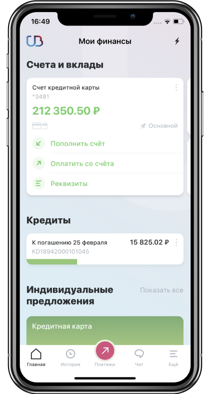
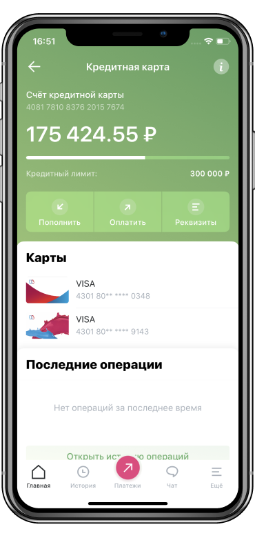
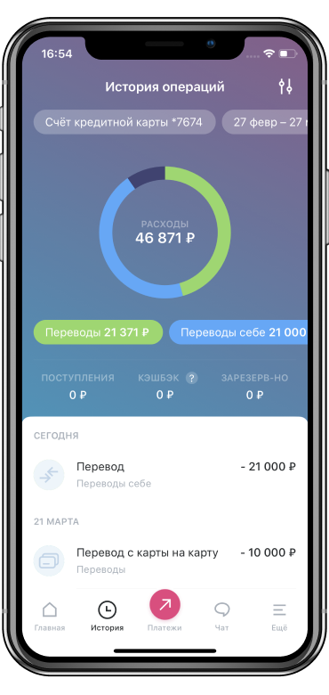
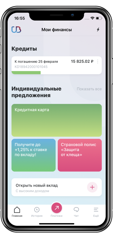
Home screen: accounts, loans and individual offersCredit card screenSpending history with a category chartLoans and individual offers
The relaunched app: home, the credit card, spending history and loans

Overview. What is UBRR?

UBRR, the Ural Bank for Reconstruction and Development, is among Russia's 30 largest banks and 100 most reliable.

The bank asked Touch Instinct to relaunch its mobile app: make it stand out, sell better and be convenient enough to replace a visit to the branch.
Goals. What the relaunch had to do

  1. The core goal
    A personal bank for every dayA personalised mobile bank for daily use, where people see the functions they use first.
    The approach ↓
  2. 01
    Modern interfaceIn line with today's remote banking and clear to anyone, whatever their age or experience.Visual system ↓
  3. 02
    Recognisable designA design that is recognisable and unique.Colour coding ↓
  4. 03
    More app usersA larger share of the bank's customers using the app.Launch ↓
  5. 04
    More salesMore bank products sold through the mobile app.Loan terms ↓

Analysis. Navigation built around the main tasks

The navigation follows what the bank's customers do most: sign in, transfer money to another bank, open and top up a deposit, pay utilities and open a new account.

Analysis and object modelBusiness, competitors, audience, system limits

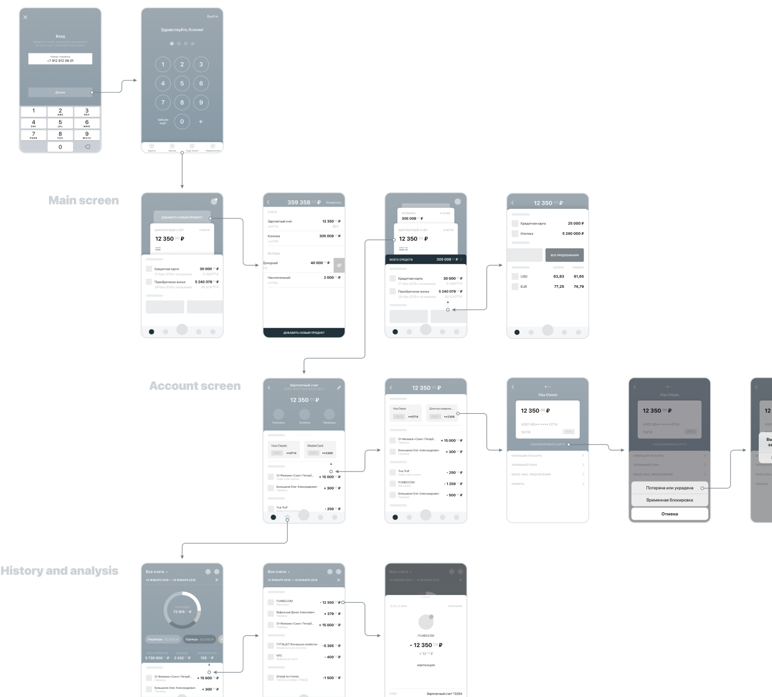
We started with an analysis of the business, competing apps, the audience and the project's tasks, and with what the system could and couldn't do. From it came an object model: every entity, its attributes and the actions on it.

User flowFrom sign-in to an account, history and analysis
User flow: sign-in, main screen, account screen, history and analysis
Part of the user flow: from sign-in to the main screen, an account, history and analysis

The approach. Convenience instead of new features

Together with the bank we decided not to add new functions. Someone who needs a loan sees loans first; someone who pays for the phone and the flat most often sees exactly that.

The main difference from the previous version is fewer steps to operations, statements, payments and transfers. Popular actions, like opening a deposit or paying utilities, take a couple of taps, and the same task can be reached in more than one way.

Every main screen was redrawn without visual clutter
Home screen with a loan and the next payment
Home: a borrower sees the loan and the next payment first
Loans, individual offers and opening a new deposit
Individual offers and a new deposit are one tap away

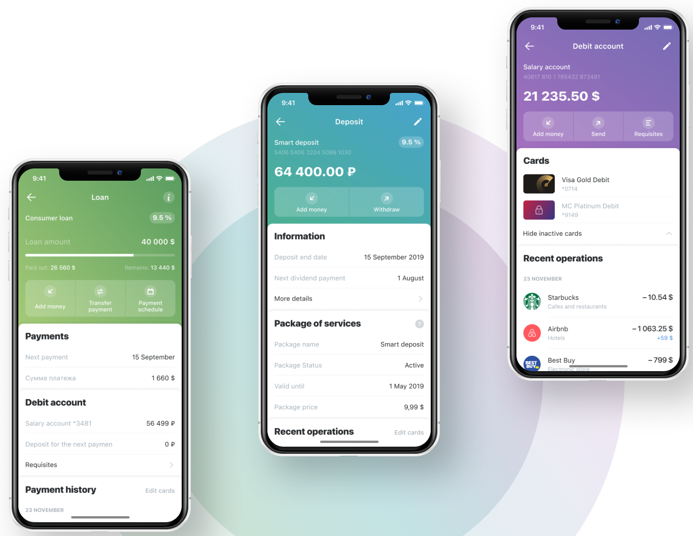
Colour coding. Each type of account has its own colour

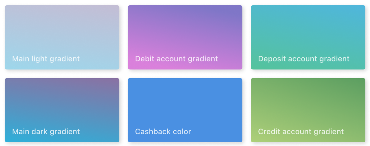
We wanted to show people that the app can do much more, and to introduce banking features they didn't know about. Each section got its own colour, carried through every transaction, page and banner, so debit and credit accounts and deposits are never confused.

Loan, deposit and debit account screens, each in its own colour
A loan, a deposit and a debit account, each in its own colour scheme
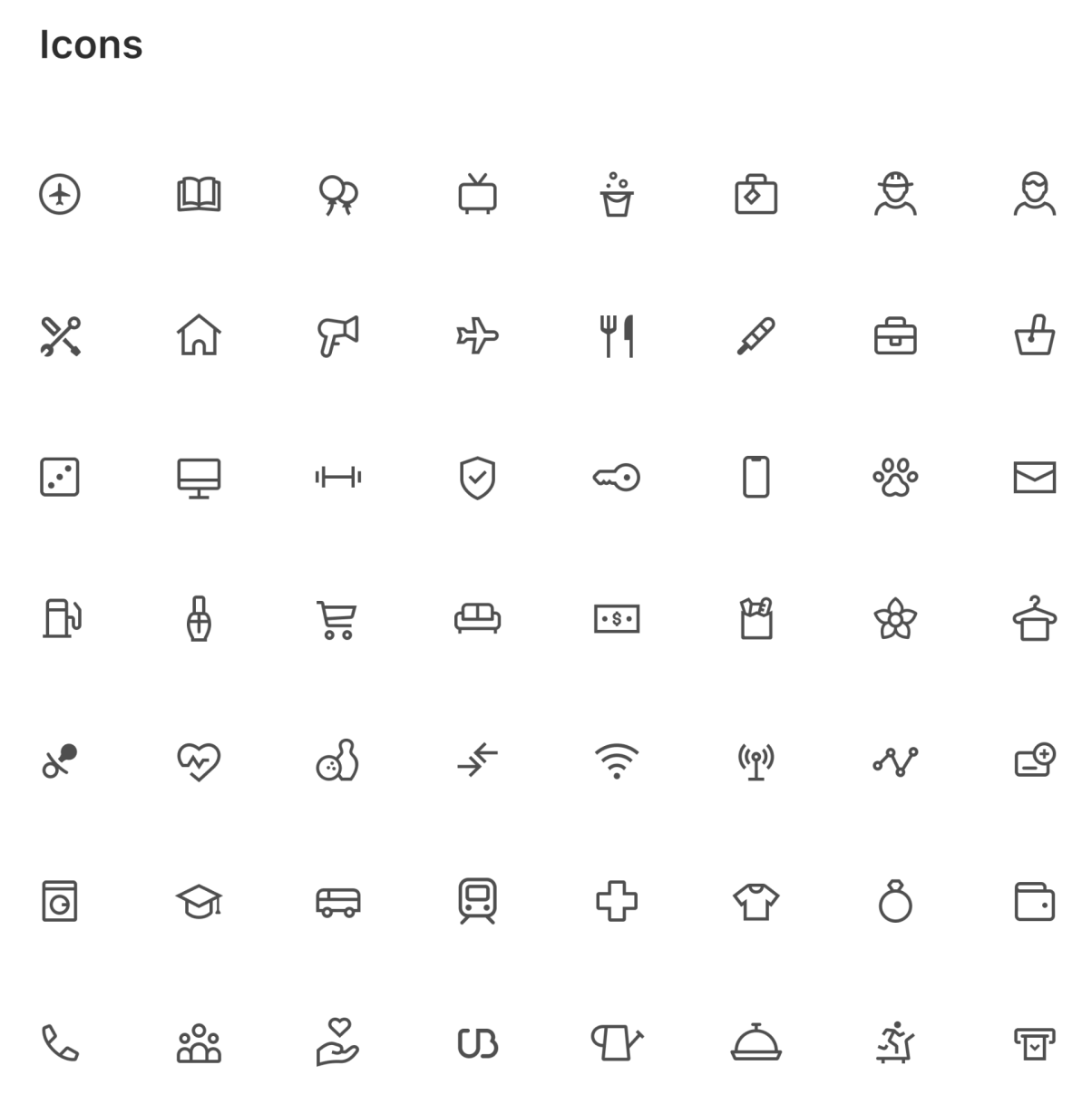
The app's icon set
The icon set
Gradients for the main screens, debit, deposit and credit accounts, and cashback
Gradients for each type of account; the type is SF Pro Text
Credit card screen
Grace periods on credit cards are visualised, so a customer doesn't miss the next payment date
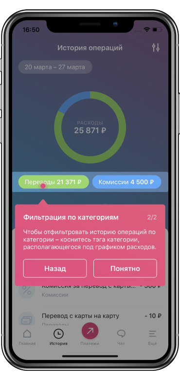
A tip explaining how to filter history by category
Each update explains its new features inside the app: here, filtering history by category
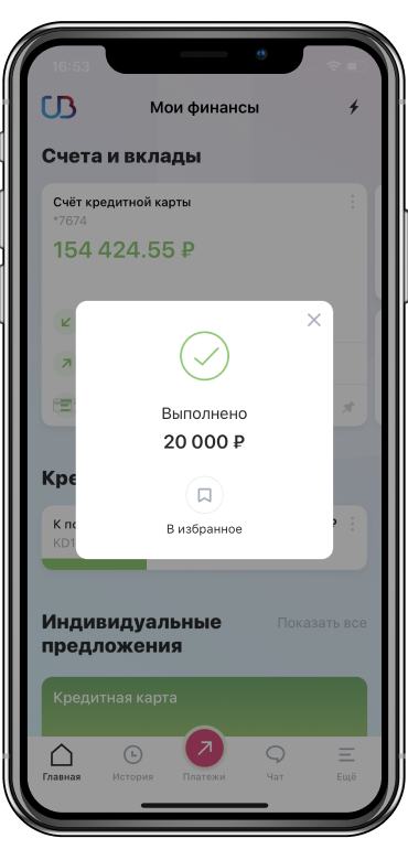
A completed payment with an option to save it to favourites
A payment finishes in a couple of taps and can be saved to favourites

Key decision. “Will I be able to afford a loan?”

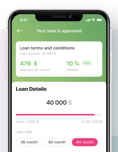
Loan screens in banking apps often say too little. We show the important figures at once: the amount, the interest rate and the monthly payment. Flexible settings let people try different values and pick the balance that suits them before they apply.

Loan terms: monthly payment, interest rate, amount and term
Loan terms on one screen: the monthly payment, the rate, the amount and the term

Launch. Shipped to loyal customers first

The first version went to loyal customers before everyone else, so we could collect feedback and check the direction. Every update introduces its new features on the onboarding screens and inside the app.

Security: card limits, remote blocking and unblocking of a card, and sign-in with a password, Touch ID, Face ID or a card number.

Result. What changed after the release

3.0 → 4.6the app's rating in the App Store and Google Play after the release
2019Retail Finance Awards, Best IT Solution for a Retail Bank

During open testing and after the release, many of our UX hypotheses were confirmed: people began to make many more transactions and operations in the app, and left hundreds of positive reviews.

After my part. The base kept growing

Touch Instinct kept developing the app with the bank: more than 100 releases in five years. In 2022 it was in the top 5 Android digital offices of the Markswebb Mobile Banking Rank, and the project later won Golden App 2021 and 2022, Retail Finance Awards 2021 and Tagline Awards 2023.

Personalisation, where people first see the functions they use, was set in the 2018–19 relaunch and remains part of the app today.

Feedback. From the client

“Touch Instinct team has done an incredibly great job. We worked together very well and had a perfectly built communication, so we got exactly what we wanted. Designer, developers and project managers have demonstrated efficiency, flexibility, and professionalism.”

Product Owner, UBRR Bank

More work. 11 projects since 2015

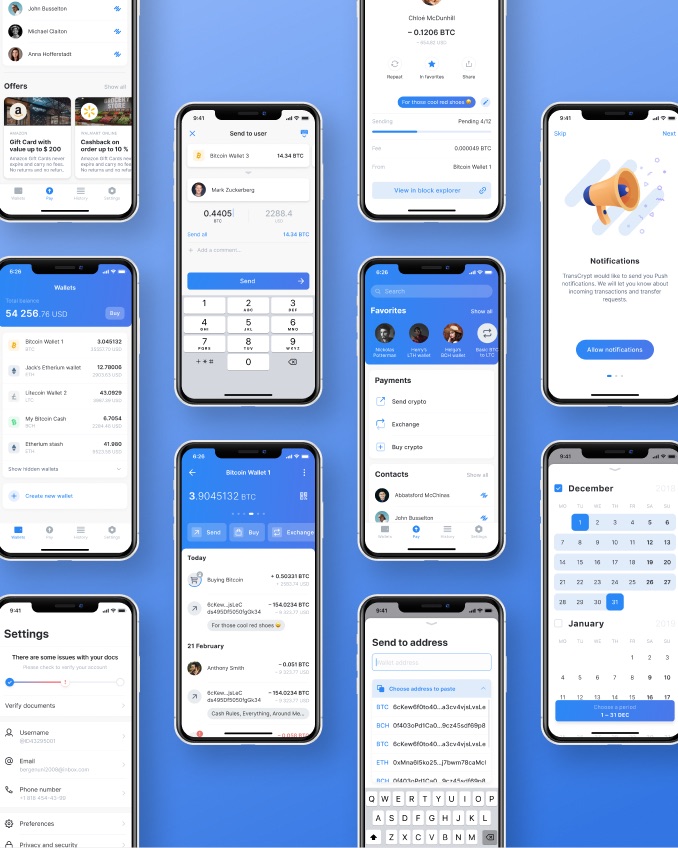
Tizer Wallet screens: wallets, sending crypto, contacts and settings

FinanceTizer Wallet2019

A crypto wallet, from MVP to full product

Lead Product Designer on contract.

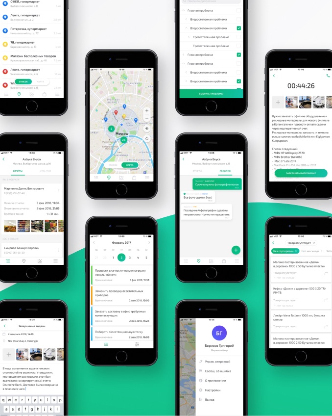
MST Lab 24 app screens: store map, task list, reports and chat with the office

ManagementMST Lab 242017–18

A B2B2C platform for field teams

Product Designer at MST Lab 24.

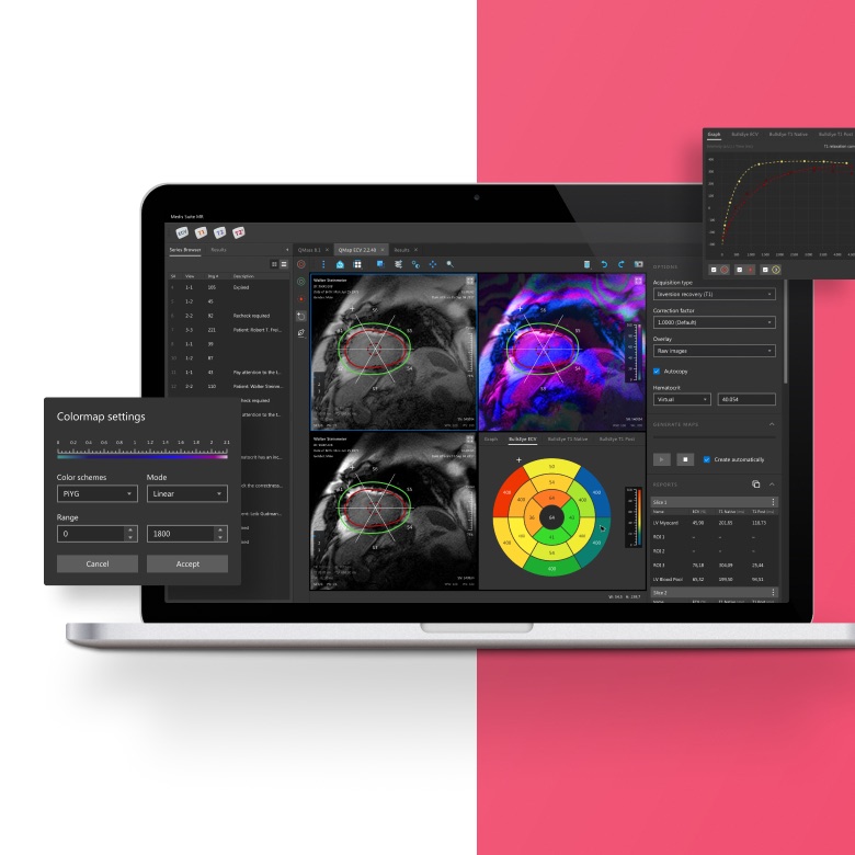
Medis Suite MR on a laptop: heart MRI scans, a bullseye diagram and colormap settings

HealthcareEPAM Systems2019–20

Molicare store and Medis Suite MR

Experience Designer at EPAM Systems.

See all work →